The Secret Art of Prompts That Sell
A practical, slightly mystical field guide to writing AI prompts that produce print-on-demand designs people actually take out their wallet for.
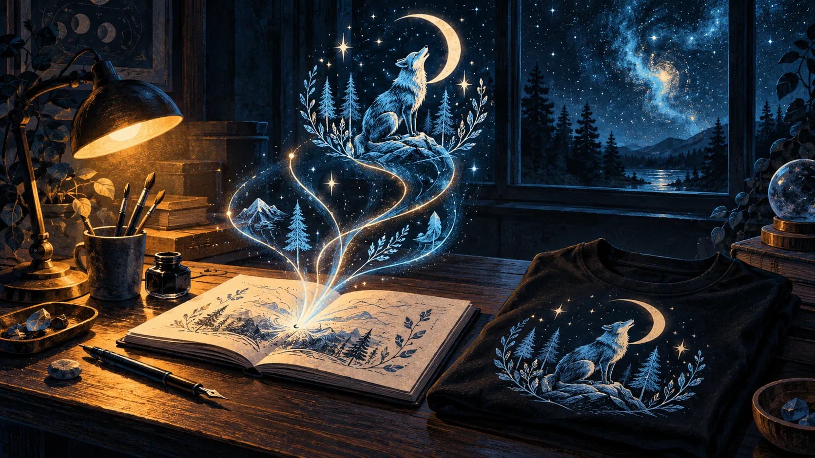
An open notebook releasing threads of light that become a fox howling at the moon, printed on a folded black t-shirt.
MagicMoon · EditorialThe short version
- Sellable designs start as sellable sentences: niche, emotion, and visual idiom in one breath.
- A great prompt names a feeling first and a subject second. Style is the last brick, not the first.
- Most POD designs fail because they look generic, and generic is what happens when prompts ask for nouns instead of moods.
- A repeatable prompt formula beats a hundred lucky one-offs. Build a small grammar, then remix.
Why some prompts sell and others just look pretty
A print-on-demand customer is not buying an image. They are buying a tiny, wearable confession: "this is who I am, this is who I love, this is the joke I keep telling at brunch." That confession is the design's real product, and your prompt is the only place where it can be encoded.
When a design fails to sell, the autopsy almost never reveals a technical problem. The lines are clean, the composition is balanced, the colors are pleasant. What's missing is identity. The image is beautiful and forgettable: a Pinterest pin, not a t-shirt someone wears to their grandmother's birthday to make her laugh.
The fix isn't a better model. It's a better sentence. Once you understand that the prompt is doing the emotional engineering, you stop tuning settings and start tuning meaning.
“A great prompt names a feeling first and a subject second. Style is the last brick, not the first.”
The anatomy of a commercial prompt
Every prompt that consistently sells follows a quiet four-part skeleton. You can call it whatever you like; we call it the FRAME: Feeling, Reference, Anchor, Modifier, Edge.
The Feeling is the emotion you want the buyer to project onto themselves: defiant, cozy, hungover, smug, tender. The Reference is the cultural or visual world you're borrowing from: a 70s book cover, a hand-drawn tour poster, a midnight diner menu. The Anchor is the specific subject, kept narrow on purpose. The Modifier shapes the medium: risograph, embroidery thread, scanned ink. The Edge is the unexpected ingredient that keeps the design from feeling like a stock illustration.
You don't need all five every time, but if you write a prompt without at least three of them, you're asking the model to make decisions you should be making yourself.
Palette is a personality test
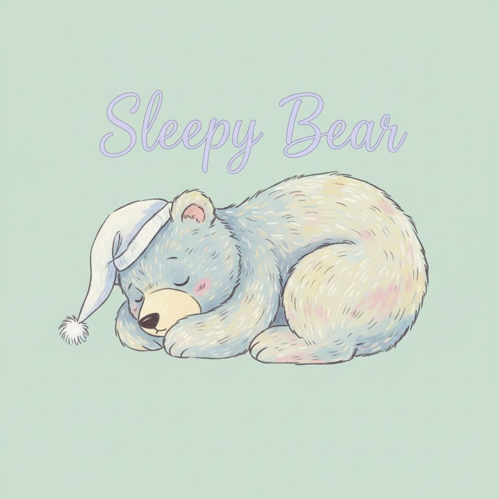
Color choice does more emotional work than any other variable in a POD design, and it does it before the buyer reads a single word. A muted four-color palette tells the visitor "I am calm, considered, probably overpriced, and you can wear me to a gallery." A six-color saturated palette says "I am loud, I am at a music festival, I am being photographed."
Most beginners pick palettes the way they pick avatars: whatever felt cute that morning. The pros pick palettes the way costume designers pick a wardrobe: to telegraph the wearer's identity to a stranger across a room. Treat palette as a casting decision, not a decorative one.
Niche is not a category, it's a sentence
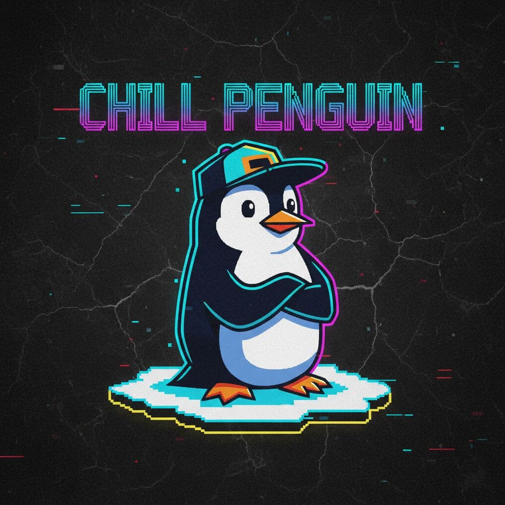
When a new seller says "I'm in the cat niche," they have not chosen a niche. They have chosen an animal. A niche is what happens when you finish the sentence: "I make things for cat people who also love 1990s skate graphics and would never buy a pun shirt." That sentence narrows the prompt, narrows the palette, narrows the buyer, and that's exactly what makes the design feel made for someone.
The most efficient POD businesses we see at MagicMoon are not the ones generating five hundred designs a week. They are the ones generating thirty designs, each one obviously aimed at the same imaginary person. Repetition of taste is what builds a brand. Range is what builds a portfolio. Pick one.
“Repetition of taste is what builds a brand. Range is what builds a portfolio. Pick one.”
The four mistakes that quietly kill conversion
First, overloading the prompt with adjectives. Five adjectives is a poem; fifteen is a fog. The model averages it all out and gives you mush.
Second, asking for "trending" anything. Trends are downstream of culture, not language. The model knows what you mean by "dreamy" and "nostalgic" and "off-kilter"; it does not know what you mean by "viral."
Third, neglecting negative space. A design that fills every pixel reads as cheap. Tell the model to leave breathing room, explicitly.
Fourth, skipping the second pass. The first generation is a draft, not a deliverable. The discipline of editing your own prompt twice before generating the next image is worth more than any model upgrade.
A workflow that compounds
A single great design is a coincidence. A repeatable formula is a business. The teams that scale on MagicMoon do something almost embarrassingly simple: they write a master prompt for their brand, then change one variable at a time. Same FRAME, swap the Anchor. Same Anchor, swap the Reference. Same Reference, swap the Edge.
After thirty rotations you have a coherent catalog instead of a chaotic mood board. The buyer feels it. The algorithm feels it. The next prompt almost writes itself, because the brand is now a grammar instead of a guess.
A final, slightly mystical note
Prompts that sell are not technical artifacts. They are tiny pieces of editorial writing aimed at a future stranger. Treat them with the same seriousness as a headline, a tagline, or the first line of a novel, because that is what they are.
If you finish a prompt and feel slightly embarrassed by how specific and personal it sounds, you are probably about to make something that sells. If you finish a prompt and it could describe a thousand other shops, delete it and start again. The internet does not need another shop. It needs yours.