The Cozy Niche Atlas
Twelve underrated subcultures begging for a print-on-demand shop that actually understands them, and what their visual language already wants.
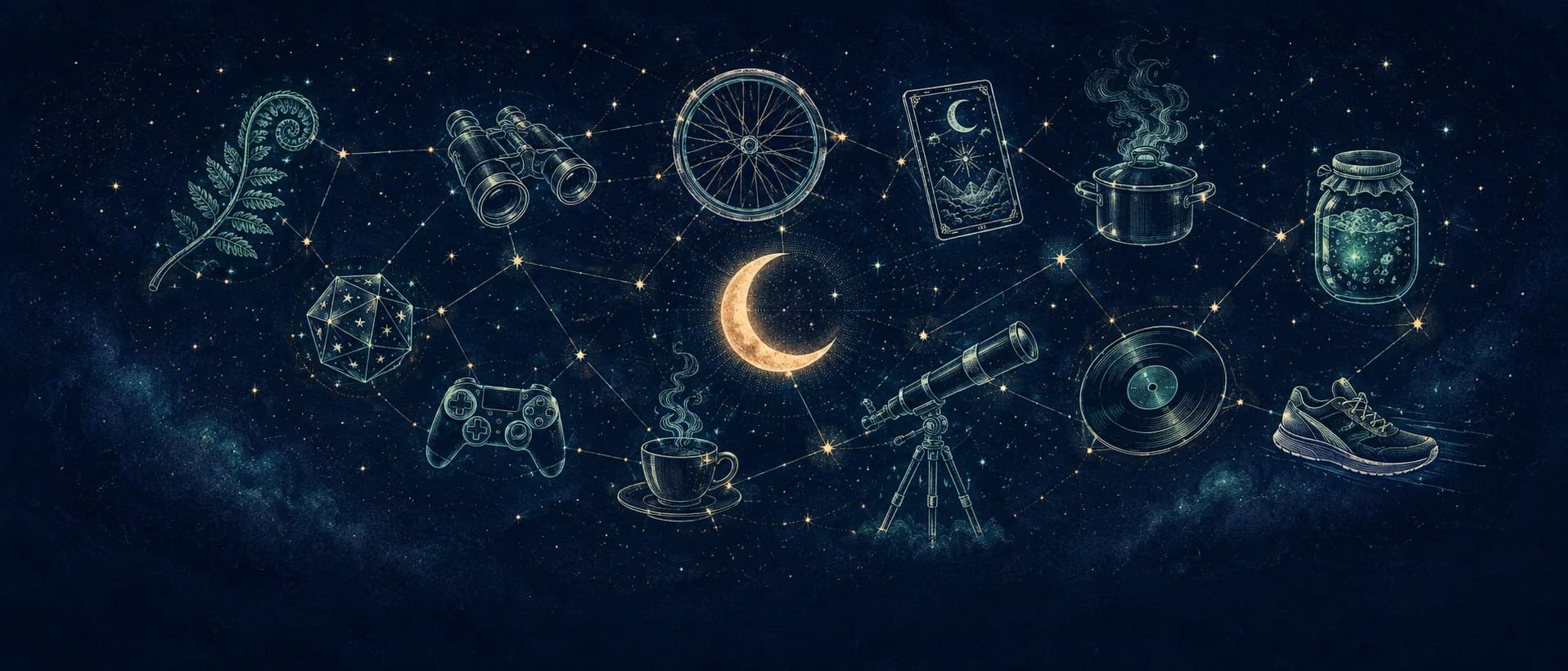
Twelve tiny subculture symbols arranged as constellations on a midnight sky around a stylised moon, the atlas as a star map.
MagicMoon · EditorialThe short version
- A real niche has its own grammar, in-jokes, and refused aesthetics, not just a topic.
- The best POD niches are the ones too embarrassing to brag about on Twitter.
- Twelve curated micro-niches, each with a starter FRAME prompt, a three-pigment palette, and the words it quietly refuses.
Why most "niches" are not niches at all
When a POD seller tells you they’re in "the cat niche," what they’ve actually picked is an animal. A real niche is closer to a subculture: a group of people with their own jokes, their own refused aesthetics, their own micro-canon of references that strangers will never quite get. Sell to a subculture and your design feels like it was made for someone. Sell to an animal and your design feels like it was made for everyone, which means no one.
This atlas is a tour of twelve subcultures we keep watching pass through MagicMoon (cottagecore queer botany, bird-watching parents, indoor cycling cults, vintage tarot atheists, occult home cooks, and several more), each with the kind of detail that lets you write a prompt instead of guessing one. Each entry gets a one-line cultural diagnosis, a starter FRAME prompt, a three-pigment palette, and a list of words the subculture will quietly reject.
One warning before you wander in: do not try to serve all twelve. The whole point of an atlas is that you pick one country and learn its language properly. So read this the way you’d read a menu you can only order from once, looking for the dish you’re slightly embarrassed to want.
“Sell to a subculture and your design feels made for someone. Sell to an animal and it feels made for everyone, which means no one.”
How to read this atlas
Every entry below is built the same way, because a good niche brief always answers the same four questions. First, the diagnosis: one line about who these people actually are, underneath the label. Second, the visual hunger: what their world already wants to see, and what it has quietly refused for years. Third, a palette of three pigments, because color does more identity work than any subject ever will. And fourth, a starter prompt written in FRAME.
FRAME is the little grammar we walked through in our first field guide on prompts that sell: Feeling, Reference, Anchor, Modifier, Edge. Feeling is the emotion the buyer projects onto themselves. Reference is the visual world you’re borrowing. Anchor is the narrow subject. Modifier is the medium. Edge is the strange, specific detail that proves a human made it. Every prompt in this atlas is a FRAME you can steal and bend.
“A niche is not a subject. It’s a grammar that strangers never had to learn.”
Cottagecore Queer Botany
This is not "plants." This is the suspicion that every Victorian botanist was a little bit in love with their lab partner, and that pressed ferns are a love language. These buyers want the romance of the herbarium without the heteropastoral gloss Pinterest stapled onto cottagecore: softness with teeth, tenderness that knows its own history.
Their eye wants hand-labelled specimens, Latin binomials, the faded ink of a field journal nobody has opened in eighty years. Two plants leaning toward one another reads as a portrait, not a pattern. Give them the museum drawer, not the flower crown.
Palette: dried fern (#4a6b4f), faded rose (#b9737f), oat paper (#e7dcc4). Words it quietly refuses: "boho," "girl boss," the word "cottagecore" printed literally, and anything that says "live laugh love." Name the feeling, never the trend.
Bird-watching Parents
Somewhere around the second kid, the weekend rave became a 5 a.m. stand by a wet hedge with a thermos and a pair of binoculars. These people are proud of it and slightly embarrassed by it, which is the exact emotional address you want. They are not "bird lovers." They are people who can identify a chiffchaff by ear, and will tell you about it.
Their visual world is the pocket field guide: precise, labelled, a little nerdy. A single, correctly-drawn species beats a flock of generic silhouettes every time. The joke should be insider (the exhaustion, the obsession, the absurdity of caring this much), not a pun about tweeting.
Palette: moss green (#5c6e57), tit-brown (#8a6a4f), cardinal red (#b23a3a). Words it quietly refuses: "tweet," easy puns, "bird mom/dad," and clip-art silhouettes. Specificity is the whole gift here.
Indoor Cycling Cults
The people who clip into a stationary bike at 6 a.m. know, on some level, that they’ve joined a religion. The instructor is a preacher, the metrics are scripture, and the endorphins are genuinely sacramental. The winning move is not to flatter the fitness; it’s to wink at the devotion. Sell them the in-joke that it’s a cult, and that they love it.
Lean liturgical: stained glass, rose windows, saints’ halos, mock-Latin mottos, all rebuilt out of wheels, watts and cadence. The contrast between holy form and sweaty content is the entire product. Bright, graphic, two-tone, loud.
Palette: studio black (#1b1b1f), neon lemon (#d6f24a), effort red (#e23b3b). Words it quietly refuses: "no pain no gain," "beast mode," "sweat is fat crying," and clip-art flames. Reverence is funnier than aggression.
Vintage Tarot Atheists
A whole congregation loves the imagery of tarot and believes precisely none of it. They want the woodcuts, the symbolism, the gravity of the Major Arcana (as theatre, as literature, as a beautiful coping mechanism) without a single drop of sincere "manifest your abundance." This is the secular wing of the occult aisle, and it is enormous.
Give them real engraving: Marseille linework, gold leaf gone green with age, ivory that has yellowed honestly. The humour lives in invented cards (The Snooze Button, The Group Chat, The Unread Email) played completely straight. Deadpan is the medium.
Palette: night indigo (#2c2a4a), tarnished gold (#c9a24a), yellowed ivory (#ece3c8). Words it quietly refuses: "manifest," "good vibes only," "the universe has your back," and neon rainbows. Play it solemn; let the joke do the smiling.
Occult Home Cooks
For these cooks, a long-simmered stock is a spell and the kitchen is a temple. They are not doing Halloween; they’re doing devotion, treating sourdough, broth and preserves with the theatrical seriousness of a grimoire. The buyer wants their everyday domestic ritual taken as seriously as they secretly take it.
Reach for the illuminated manuscript: marginalia, drop caps, woodcut vegetables, recipes written as incantations. The pot belongs on an altar. Keep it rich and earthy: this is candlelight, not a pumpkin-spice aisle.
Palette: reduced bordeaux (#5a1f2a), absinthe green (#6b7d3a), bone (#e8e0cf). Words it quietly refuses: "spooky," "basic witch," cartoon pumpkins, and "stirring up trouble." The magic is in the sincerity, not the costume.
Sourdough & Fermentation Obsessives
These are the people who have named their starter, photograph their crumb, and worry about their kombucha like it’s a pet that might be getting sick. It is tender, slightly unhinged, deeply earnest pride in keeping something alive. Sell them the loving absurdity of being a parent to a jar.
Think Victorian scientific plate: the microbe rendered with reverence, the jar drawn as a portrait, the crumb mapped like a geological cross-section. Warm, papery, hand-annotated. The flex is care and patience, not "homemade with love" in gold script.
Palette: golden crust (#b07a3c), crumb cream (#efe3cb), kombucha green (#6f8f5a). Words it quietly refuses: "homemade with love," "rise and grind," "knead it real good," and clip-art wheat. Treat the culture like a character with a name.
Forever-DMs
Every table has one: the person who always runs the game and never gets to play it. They build worlds nobody finishes, prep for sessions that get derailed in ten minutes, and carry the entire group’s fun on their back. The emotional address is the gloriously thankless labour of the Dungeon Master, not a generic dragon.
Their aesthetic is the hand-drawn dungeon map on graph paper, the coffee-ringed prep notes, the DM screen seen from behind. Sepia, ink, rubber-stamp icons. The humour is operational: players ignoring the plot, adopting the wrong NPC, derailing everything.
Palette: parchment (#e3d6b0), sepia ink (#4a3522), die red (#a32f2f). Words it quietly refuses: "roll for initiative" on its own, an overused "nat 20," clip-art dragons, and "epic loot." The inside joke is the prep, not the payoff.
Cozy Slow Gamers
These players don’t want to win; they want a small, orderly world to tend. Stardew farms, Animal Crossing islands, a polite debt to Tom Nook: games as a refuge from a loud life. The feeling is comforting melancholy: a tidy little place that is always 2 a.m. and always safe.
Speak in retro game boxes and dithered pixel art: soft seasons, gentle rain, a cabin with one window lit. Muted-bright, four-colour, nostalgic. This is the opposite of RGB gamer aggression; it’s a quilt, not a battlestation.
Palette: meadow green (#7fae5a), peach sky (#f3c98b), lagoon blue (#6fb6c4). Words it quietly refuses: "gamer girl/guy," "git gud," clip-art controllers, and "level up your life." Cosy is a mood, not a feature list.
Night-shift Nurses & Carers
The people who keep the world running while it sleeps survive on coffee, gallows humour, and each other. Their identity is welded to the job in a way day-shift will never understand: twelve-hour shifts, screaming monitors, 3 a.m. clarity. They don’t want to be called heroes; they want to be recognised by someone who has been there.
Borrow from vintage hospital safety posters and industrial signage: flat, two-tone, dryly functional. The warmth comes from the in-joke: the coffee, the alarms, the specific exhaustion. Keep it deadpan; sentimentality is the enemy.
Palette: scrub blue (#3b5a6b), hospital grey (#c7d0d2), coffee amber (#9a5b2e). Words it quietly refuses: "hero in scrubs," "nurses are angels," clip-art stethoscope-hearts, and "blessed to be a nurse." Solidarity, not a halo.
“Day-shift will never quite understand, and that shared secret is the entire product.”
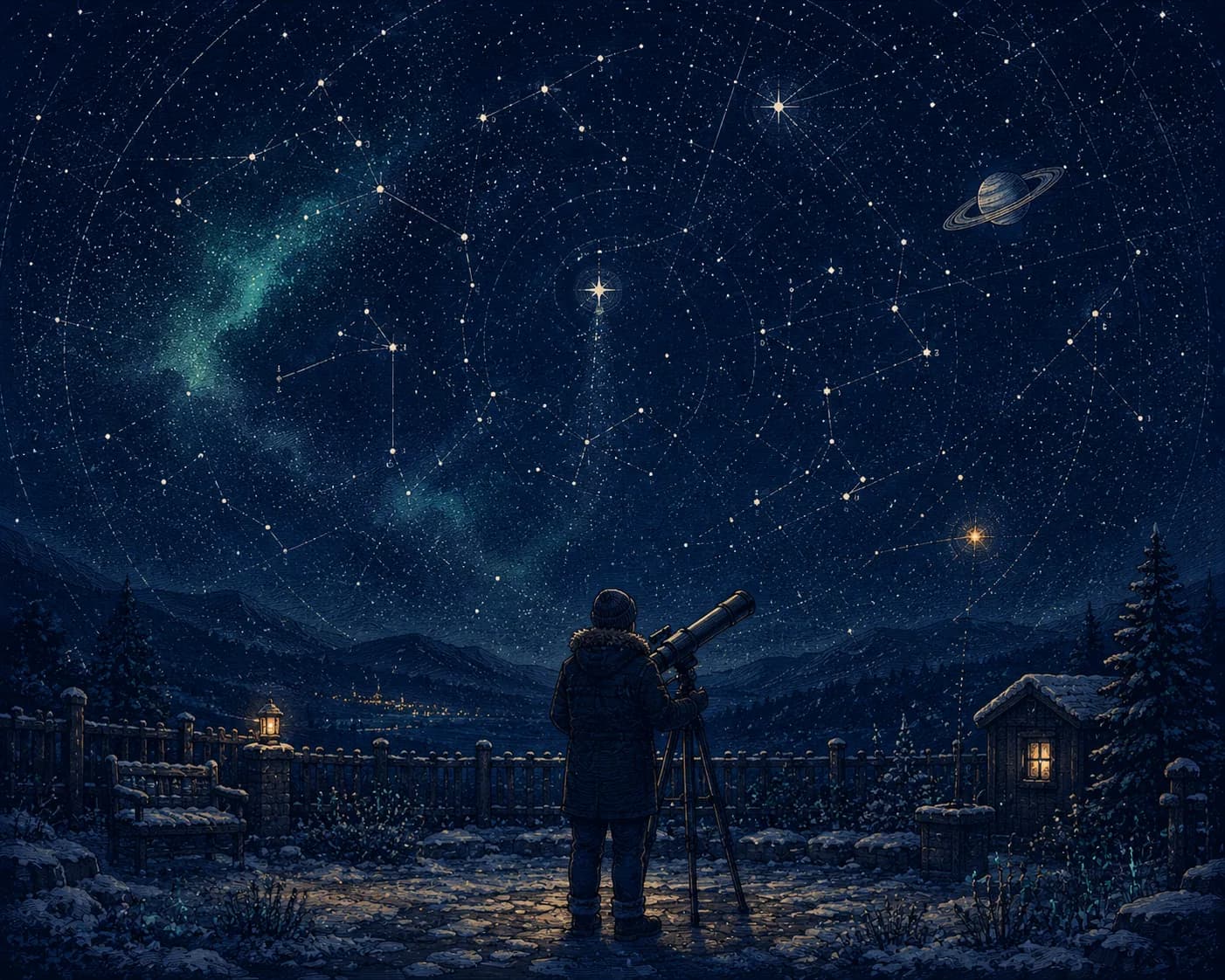
Backyard Stargazers
These are the people who haul a telescope into a freezing garden to look at a faint grey smudge, and call it the best night of the month. The feeling is humble wonder, the patience of the amateur who knows exactly how small they are. This is the quiet, cold, real cousin of "galaxy print," and it deserves better than neon nebulae.
Speak in 19th-century star charts: engraved constellations, dotted orbits, ink-dark skies with hand-numbered stars. A lone figure behind an eyepiece reads as the whole story. Restrained, precise, reverent: let the dark do the work. (We may be a little biased about this one.)
Palette: deep night (#1e2a4a), moon silver (#c9d2dc), far amber (#d8a24a). Words it quietly refuses: "to the moon," tie-dye galaxies, "shoot for the stars," and "stargirl." Awe is quieter than a slogan.
Vinyl Diggers
These listeners flip through crates for hours, distrust the algorithm, and will absolutely explain the difference between pressings. It is tactile devotion (to the object, the ritual, the hunt) dressed up as snobbery but really about love. Sell them the feeling of the find, not a clip-art music note.
Their reference is the mid-century jazz sleeve: Blue Note typography, grainy duotone photography, generous negative space. The object (a crate, a sleeve, a hand pulling a 45) is the hero. Cool, restrained, analog.
Palette: groove black (#16161a), label orange (#e07a3a), sleeve cream (#efe7d6). Words it quietly refuses: "good vibes," "music is life," clip-art notes, and "drop the beat." The grain is the point.
Long-distance Runners
Not the medal-chasers, but the ones who run at 5 a.m. in the rain for the silence, not the kudos. Their identity is private and a little austere: the early dark, the empty road, the deliberate refusal to post about it. The address is intimacy and solitude, the exact opposite of the motivational-poster runner.
Borrow from minimal Scandinavian event posters: one figure, lots of empty space, a single road dissolving into fog. Quiet two-tone, generous margins, no hustle. The whole design should feel like something you keep to yourself.
Palette: dawn grey (#8a949b), rain blue (#4a6675), reflective orange (#e6622e). Words it quietly refuses: "no excuses," "pain is weakness leaving the body," "run fast," and clip-art stopwatches. Understatement is the flex.
Now pick one and disappear into it
You have twelve doors. The instinct is to keep all of them open (a little cottagecore, a little tarot, a little running) and end up with a shop that smells of nothing. Resist it. Pick the single subculture you’d be slightly embarrassed to admit you belong to, because that embarrassment is just proof that you actually understand it.
Then do the boring, powerful thing: take that one starter prompt and run it thirty times, swapping a single variable each pass. Same Feeling, new Anchor. Same Reference, new Edge. That’s how a FRAME becomes a collection, and a collection becomes a brand. The atlas only points at the countries; you still have to go and live in one. The internet has enough general stores. It’s waiting for your weird little specialist shop.
“The niche you’re slightly embarrassed to admit is almost always the right one.”